Best practices for designing a Card
In this article we've collected some best practices we adhere to when designing Cards for App Directory apps and you're welcome to copy us. ;-)
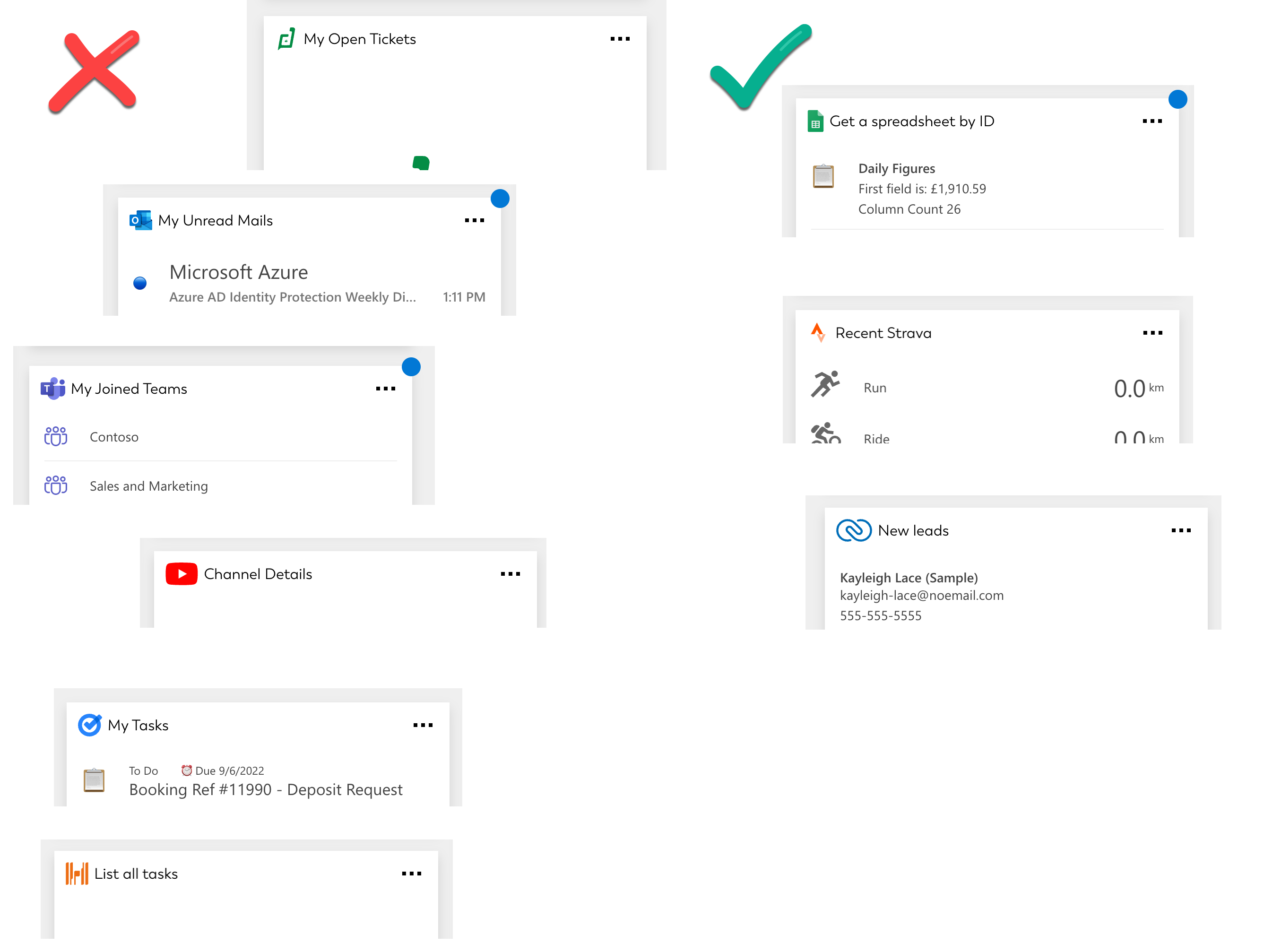
Title
Be mindful how you capitalise a Card’s title. It shouldn’t be “My Unread Mail” but “My unread mail” as that’s easier to read. However it should be “Joined Teams” if Teams is a technical term used in the original UI.
Try to avoid starting every card with “My” as the entire dashboard is already a space for me, so instead of “My tasks” simply “Tasks” will suffice.
Also Card titles don’t need to start with “List…” as that’s self-evident when you see the card; an exception to this could be if the API’s endpoints, too, use “List…” in their titles.
Empty state
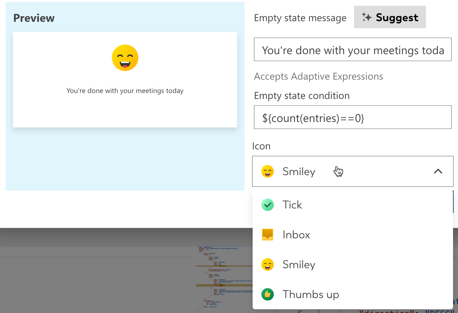
Cards should be equipped with an empty state phrase that matches their nature. So instead of “This card is empty” use “You have no more leads to show”. Try and adopt a friendly and personal tone; instead of “No more events” you could say “You’re done with your meetings today”.
An empty state message that directly addresses the user isn’t always necessary; for example “You have no joined Teams” could feel awkward when “There are no Teams to display” seems more matter of fact.
Try an extra friendly tone for everyday cards (such as tasks, emails, events), e.g. “You’re all caught up” instead of “No more tasks to display”. However, items that are less everyday, such as a payslip or leave request, should be mentioned in the empty state, e.g. “There are no payslips to show”
If an app has lots of variations of similar titles, such as “New tickets”, “Open tickets”, “Unassigned tickets”, then avoid copying the attribute into the empty state; just saying “No tickets to show” will work across the board.
Double-check the empty condition is compatible with your JSON’s structure, for example ${count(entries)==0} will only work if there is an array named entries and you’re expecting it to really be equal 0.
Pick one of the built-in icons to add some visual interest to your card, but not every card needs one. For example “No joined Teams to display” is really more an informational empty state and would feel ‘too fun’ with an icon.
Training data
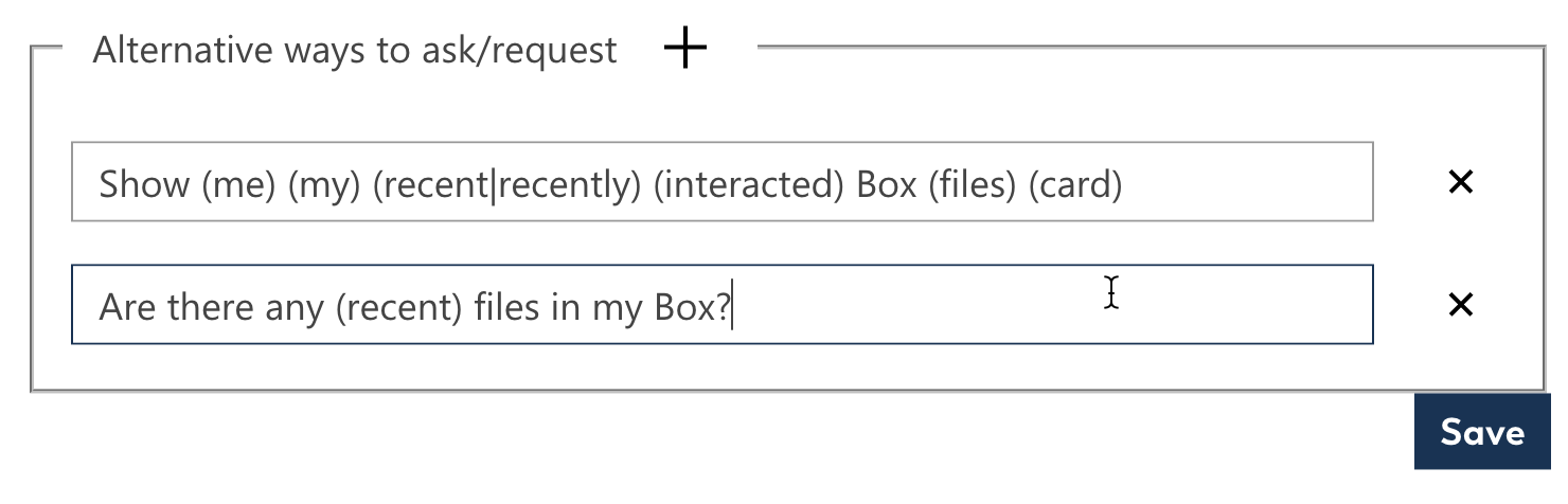
Every Card should have a minimum of two training phrases, one posed as a question and the other one as a command. Try and incorporate the Utterances syntax as it will help users naturally discover this feature.
Do repeat the name of the app in the first utterance, and ideally most other utterances, unless it won’t construct a grammatically correct sentence. Featuring the app’s name will help the user make a decision if there’s ever multiple matches. For example if the user says “Show me my files” the chatbot may respond with “Do you mean: Show me my Dropbox files or Show me my Box files”
Card layout
Sometimes it can be hard to visualise how to turn the simplistic output from an API into a visually appealing card. For example in the case of Box, the “Card generator” makes a Card that looks like this:
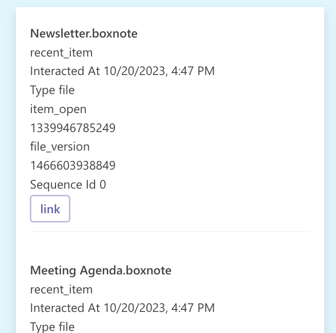
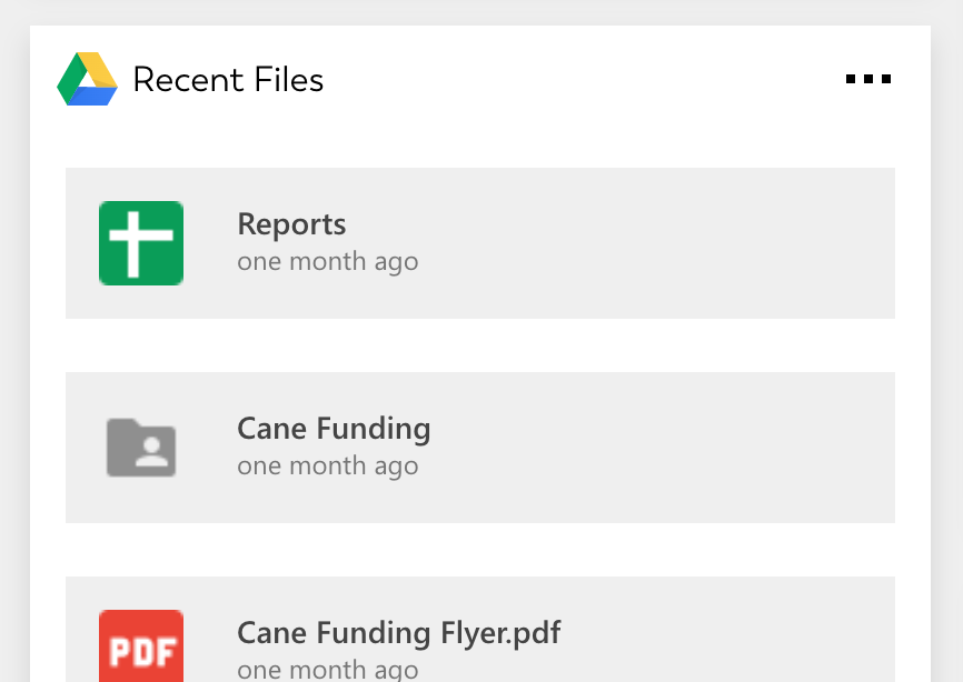
While clearly a list, this offers the user little added value over reading the JSON file outright. By comparison, the finished Card we zipped-and-shipped as a template looks like this:
It easily abstracted away everything but the title and timestamp, and turned the “link” button into a “Open link” action for each list entry.
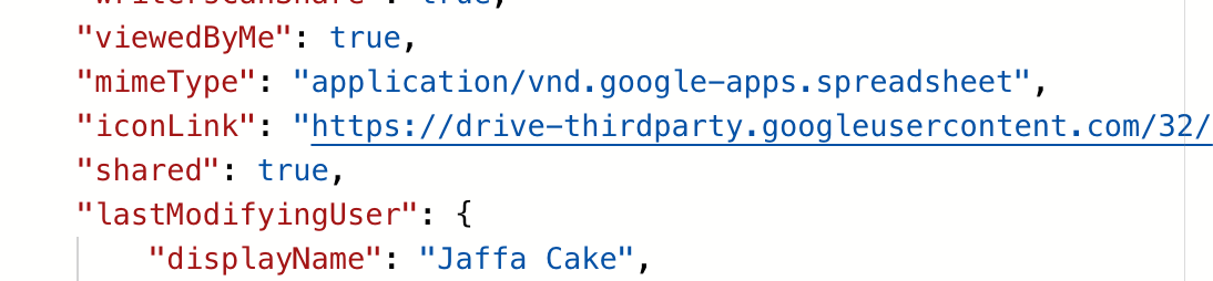
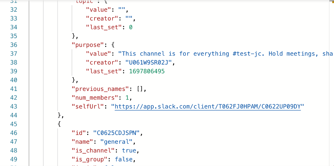 The JSON that the API delivers in this case
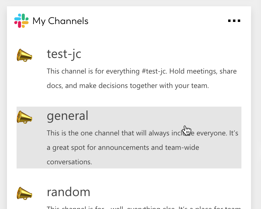
Or let’s look at a similar example where we want to list channels from a Slack user.
Consider the left and right card below.
The left one was a first iteration which already does a good job at correcting the mistakes the “Card generator” would make, by abstracting away needless attributes from the JSON.
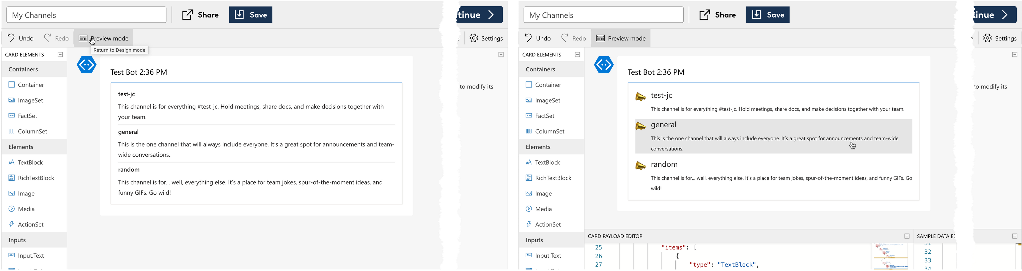
But with just a few simple changes the right card adds more flair that elevates the Card's visual appeal.
1. Visual hierarchy
By increasing the title’s font size, and decreasing the description’s font size, we’ve made the card easier to scan at a glance. Try and play around also with the Weight, Color and Subtle options to find a balance.
2. Zhush up the list
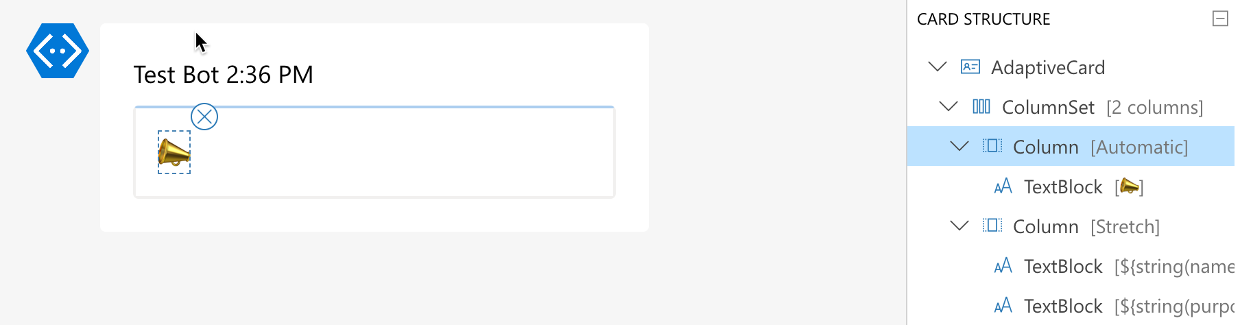
Introduce a ColumnSet where the left-hand column is used for an icon, and the title + description wander into the right column.
 Google or Atlassian APIs sometimes have built-in type icons
Sometimes the JSON will already contain icon links for issue or file types that you could use.
But in a pinch, a simple emoji (typed into a size ExtraLarge TextBlock) works well enough for this.
You could also extract an icon from the original UI and embed it into an Image block using a Base64 converter (such as Base64 Image Encoder)
 Instantly feels familiar by borrowing from the Teams UX
3. List entry separation
 Looks a bit boring
Horizontal lines are of course the go-to separation for list items. However, if used everywhere this can lead to the dashboard looking a bit samey. Try and find more interesting ways to separate your list entries.
For example simply increasing the Spacing for your items can give enough negative space to visually separate items. This works especially if you also use Action.OpenUrl as that creates a hover effect to show each item is clickable.
Or you can add style: "Emphasis", to make each list item get its own little box. That works especially well if you also use an icon.
Card structure
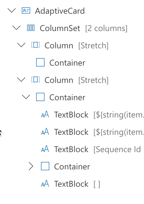
Containers are seldom necessary
Try and keep the structure of your Card’s payload as flat as possible.
Unlike what is the fashion with website frameworks, in an Adaptive Card not everything needs to be wrapped into its own Container element.
A ColumnSet can use $when just as well, so it’s entirely possible your Card may not have a single Container in it.
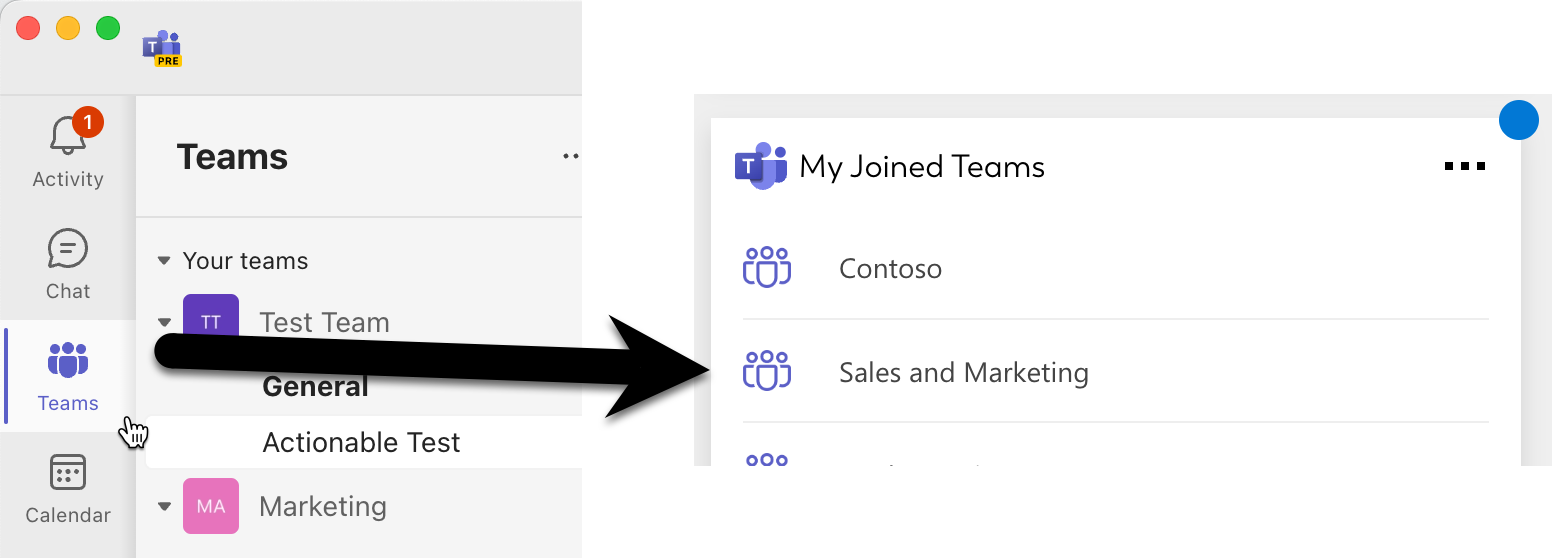
Summary view
The summary view is shown instead of the full card you made in the Designer when the card is very small (either size 1x1 or 2x1). Instead, clicking this summary view will open the full card in a popover.
Let’s go through the best way to configure your Card’s summary view from the Settings menu in the Adaptive Card designer.
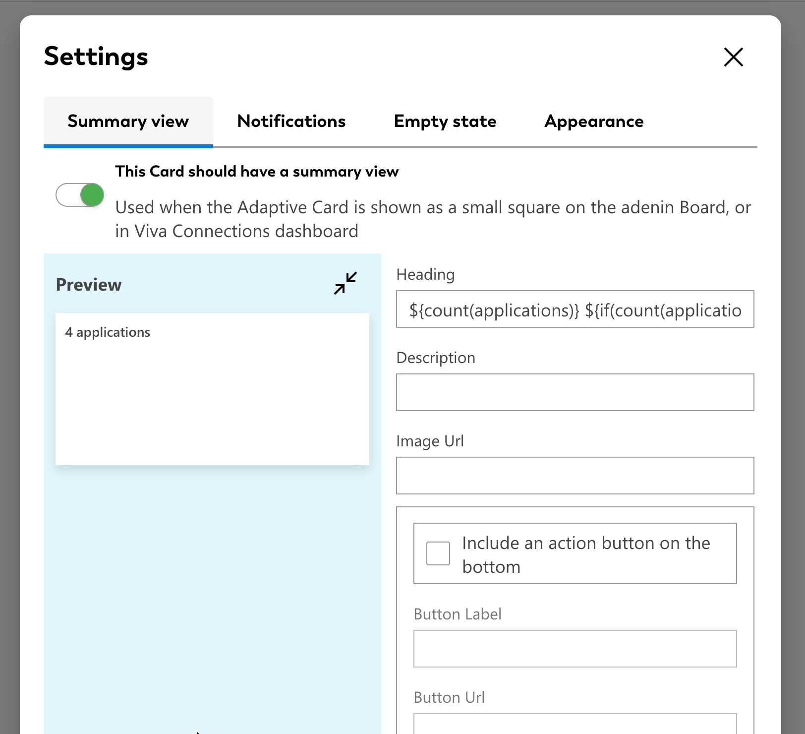
There is basically three recommended ways to do a Summary view, depending on what type of Card you’re dealing with.
Type 1: Eye-catcher
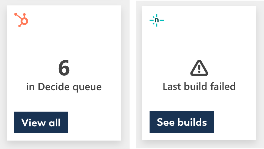
This is a pretty way to show a big number of items or maybe a warning emoji in case something needs your attention.
To configure this style, the key thing is that your Heading must be less than 3 characters.
The left card for example has the following Heading:
${if(count(contacts) >= 20, '20+', count(contacts))}
This means that it will count the number of contacts in the list, and either show the number or just show ‘20+’ if there are more than 20 contacts. Such Adaptive Expressions allow you to incorporate different IF statements into your heading.
If you have a summary view that is supposed to show a count, try and apply this Eye-catcher type, rather than going over the three character limit which will result in a bland card.
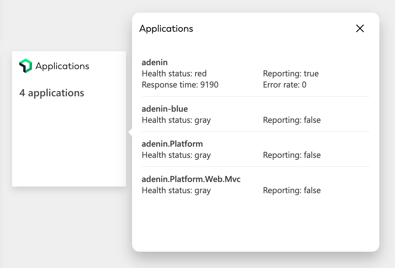
Type 2: Latest item

This is useful where you have a list of news items, helpdesk cases or sales leads and want to show the name or teaser of the that very first item.
To configure this we want to repeat the title of the first item in our heading as follows:
${items[0].resource.fields.title}
Your JSON may be different but the key to point out here is that with [0] we’re picking the title from the very first item in our array.
The description than just details how many more items there are with this:
${sub(count(items), 1)} other news stories
This basically counts the number of the total items and deducts one.
This type also pairs well with an image, particularly when viewed in the 1x2 size. The image of the first article can be gotten in a similar way to the headline:
${items[0].resource.fields.pictureThumbnailURL}
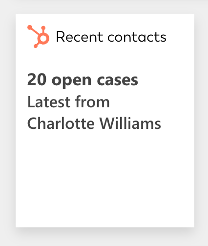 Another example for this type could be a counter for open tickets where we start the heading with a count of open cases, and mention the latest case’s reporter name below. Seeing the name (or company name) change throughout the day is quicker to pick up compared to simply seeing a number.
Heading:
${count(contacts)} open cases
Description:
Latest from ${contacts[0].properties.firstname.value} ${contacts[0].properties.lastname.value}
Action button
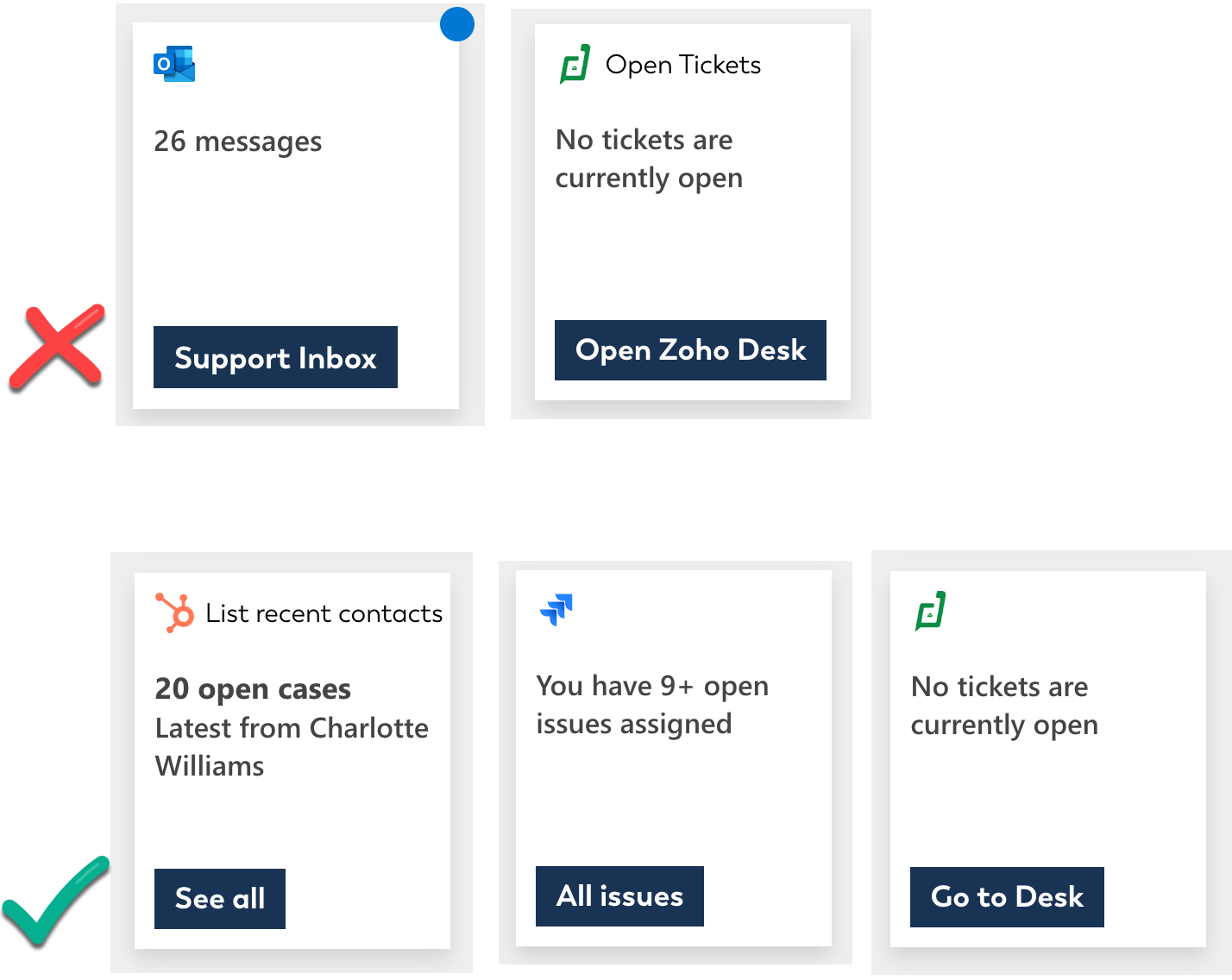
You can add an “action button” that directs the user to see the UI of the main app so they can quickly jump to their original source of the card’s data. Try and keep button labels as short as possible but try and include a verb such as “Go to”, “See”, “Open” if there’s room.
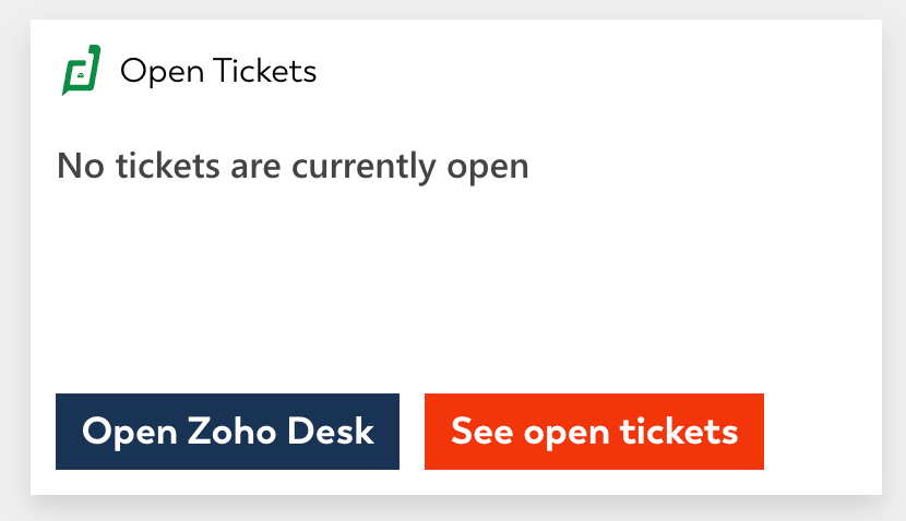
You can include a second action button but this will only show if the Summary view is shown in the 2x1 size.
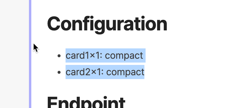
To adjust which size summary views are available for a card go to the Notebook designer and edit these lines as required:
card1x1: compact
card2x1: compact
Empty state
Finally, make sure your card’s heading includes handling for an empty state. For example by wrapping it into an Adaptive Expression like this:
${if(count(contacts)==0, 'There are no contacts', count(contacts) + ' open contacts')}